The task
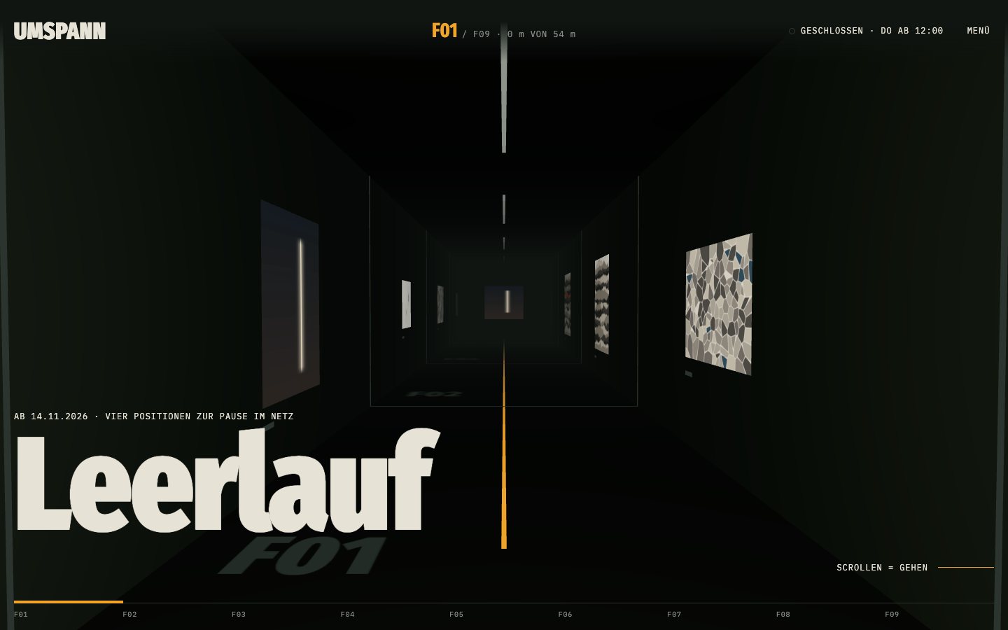
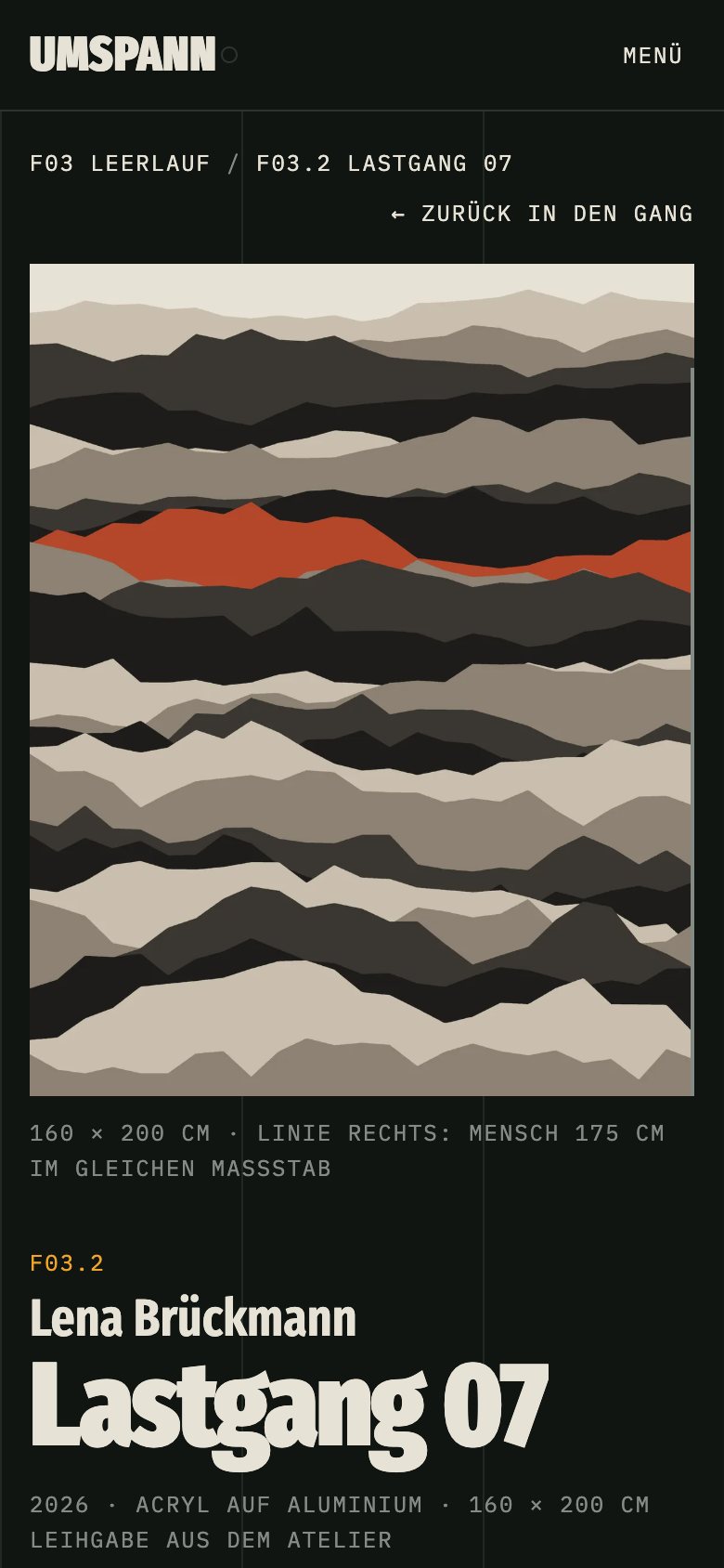
Gallery websites usually look the same: a white page, a thin font and a grid of square thumbnails, so a painting ends up looking like a product in a shop. I wanted to show a site you remember after one visit, where the exhibition feels like a place. This is a sample project: the gallery, the building, the artists and the works are made up. The works are generated in code, each artist with their own set of rules, and the audio guide voice is synthesised.
Role
Concept, art direction, design, development, 3D, audio guide
What I did
- Concept from the building: the gallery lives in a decommissioned electrical substation. The exhibition is the switching corridor, rooms and works are numbered like switchgear fields, and the sitemap in the footer is drawn as the wiring diagram of the house.
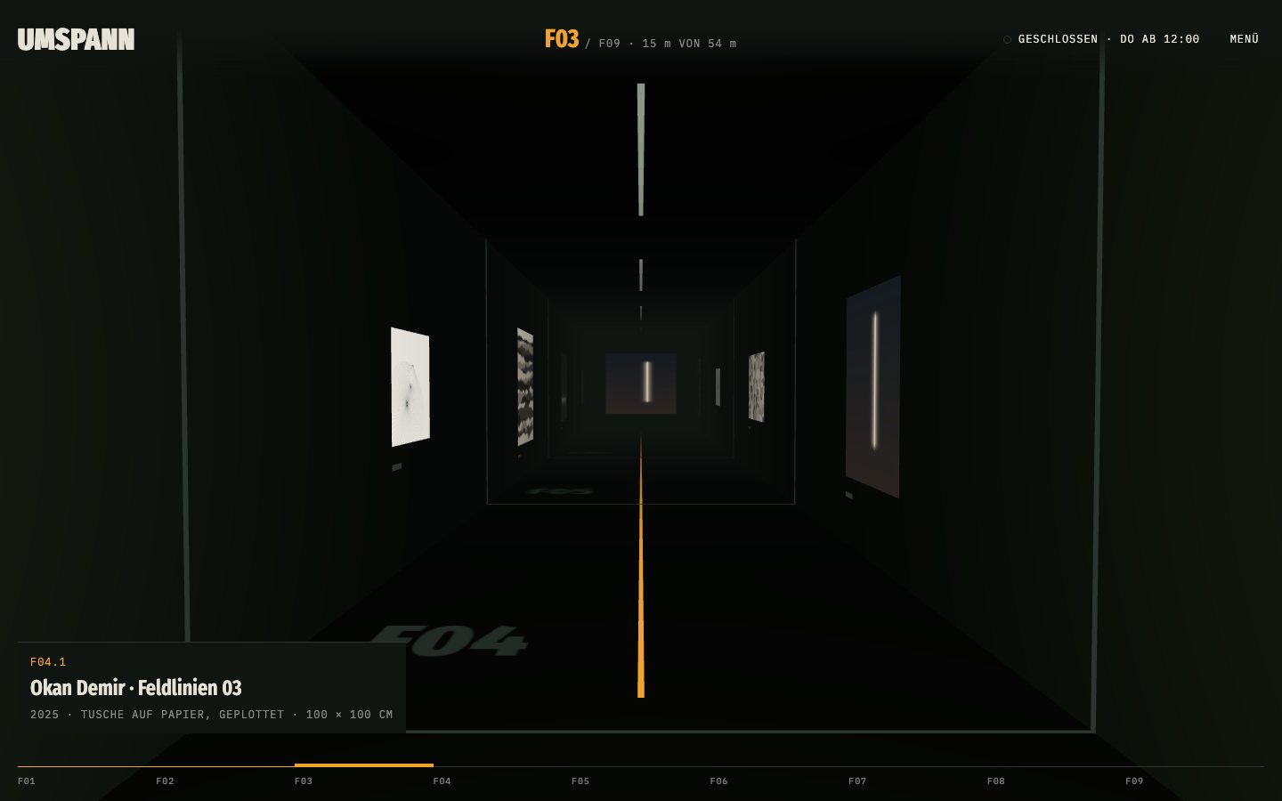
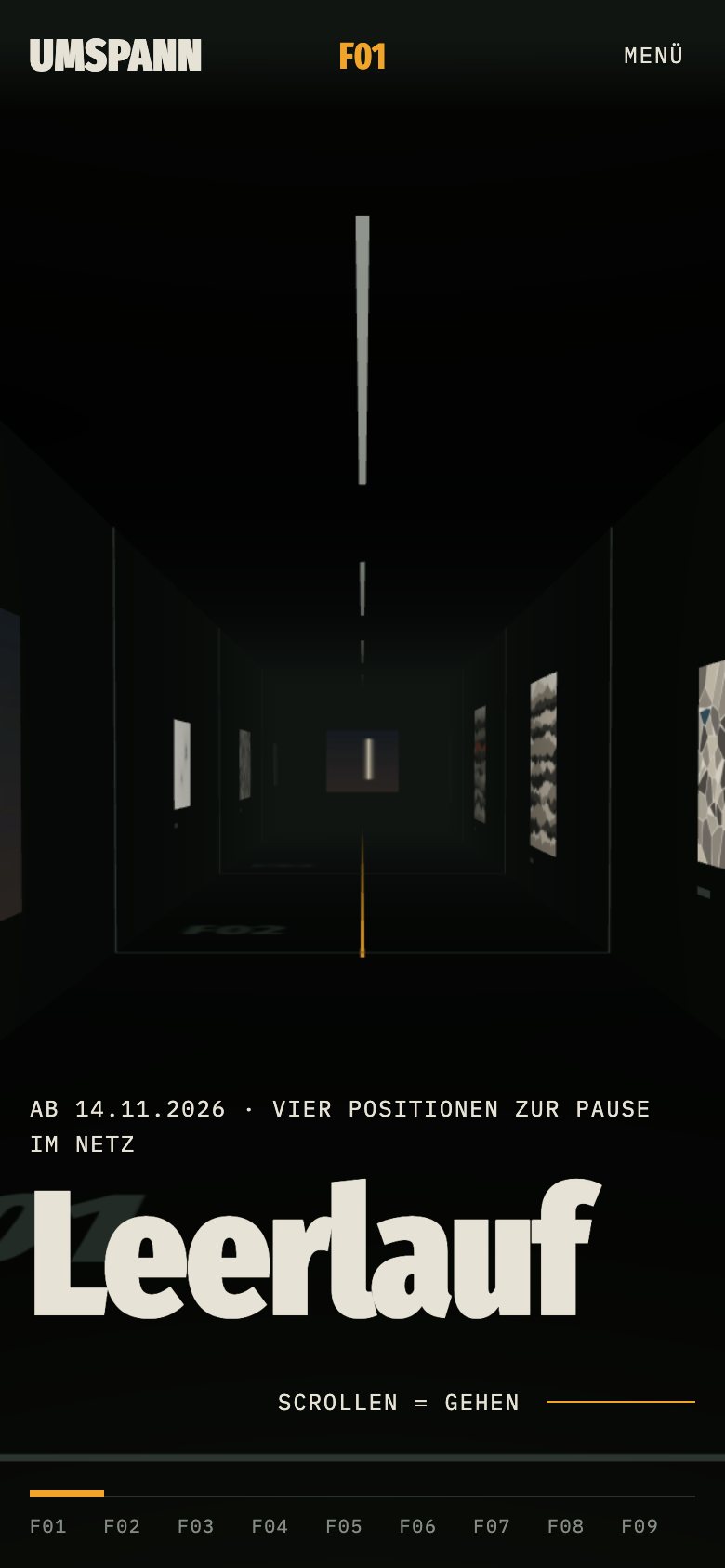
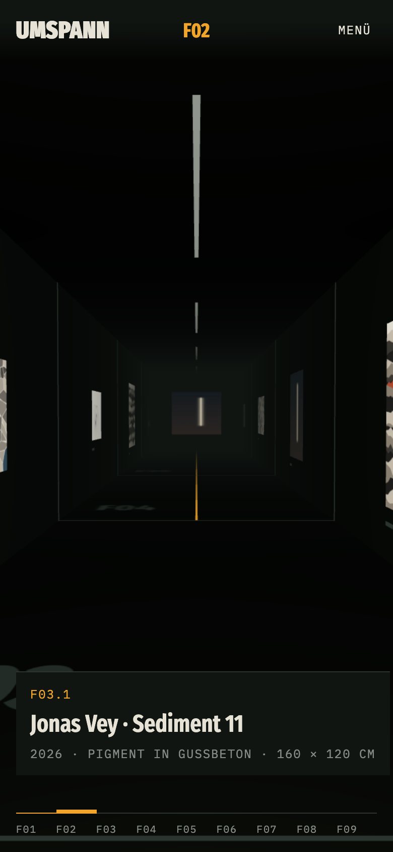
- A 3D corridor on the home page: scrolling is walking. A counter shows the field and the metres walked, a giant field number marks each new section, and a click on a work grows it from the wall into its own page.
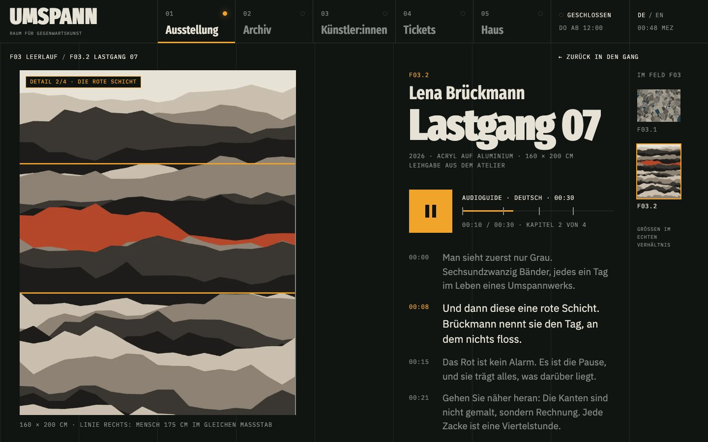
- Work pages with an audio guide in German and English: the image zooms to the detail the voice talks about, the current line of the transcript lights up, and a line next to the work shows a 175 cm person at the same scale.
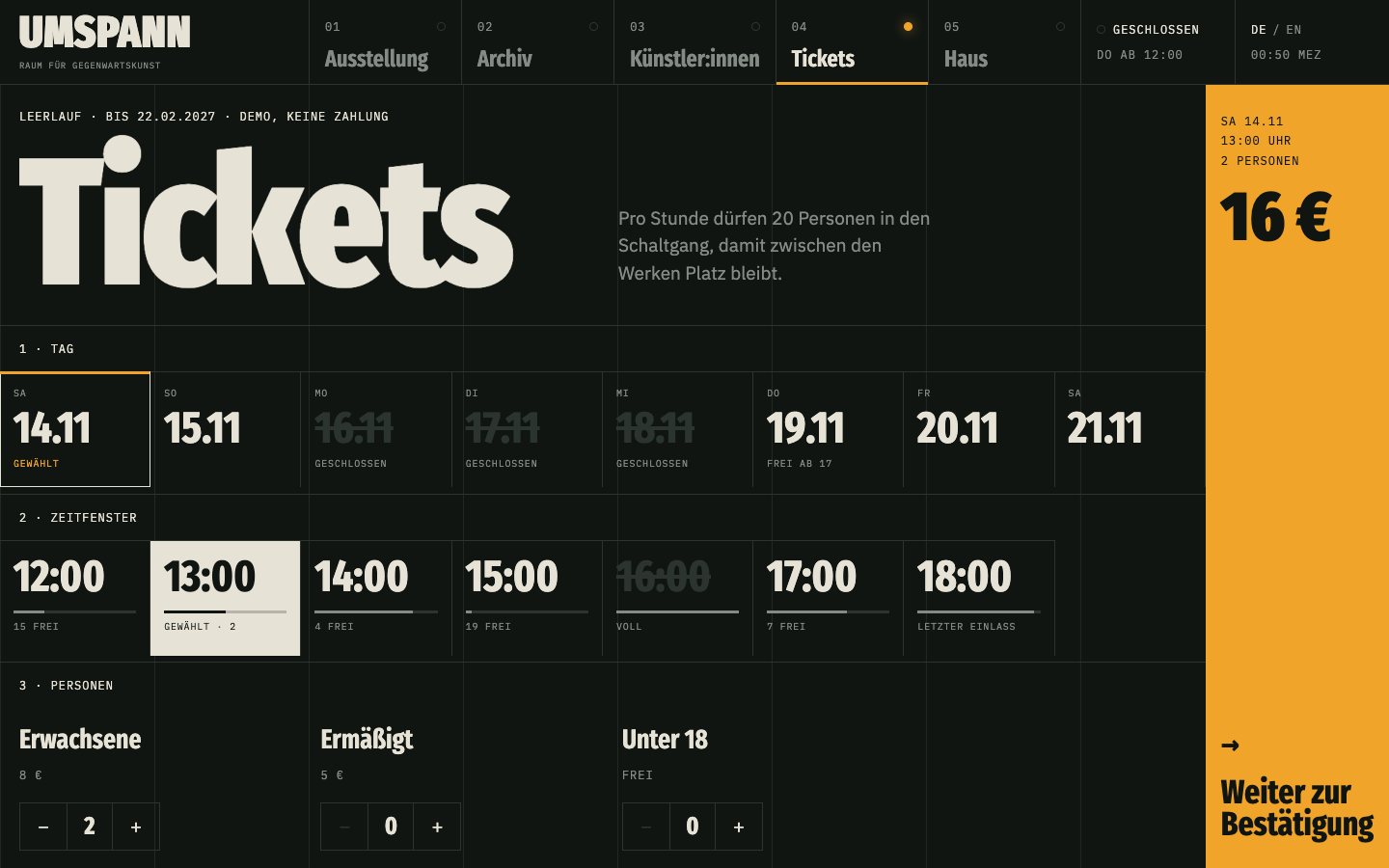
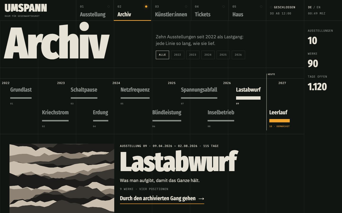
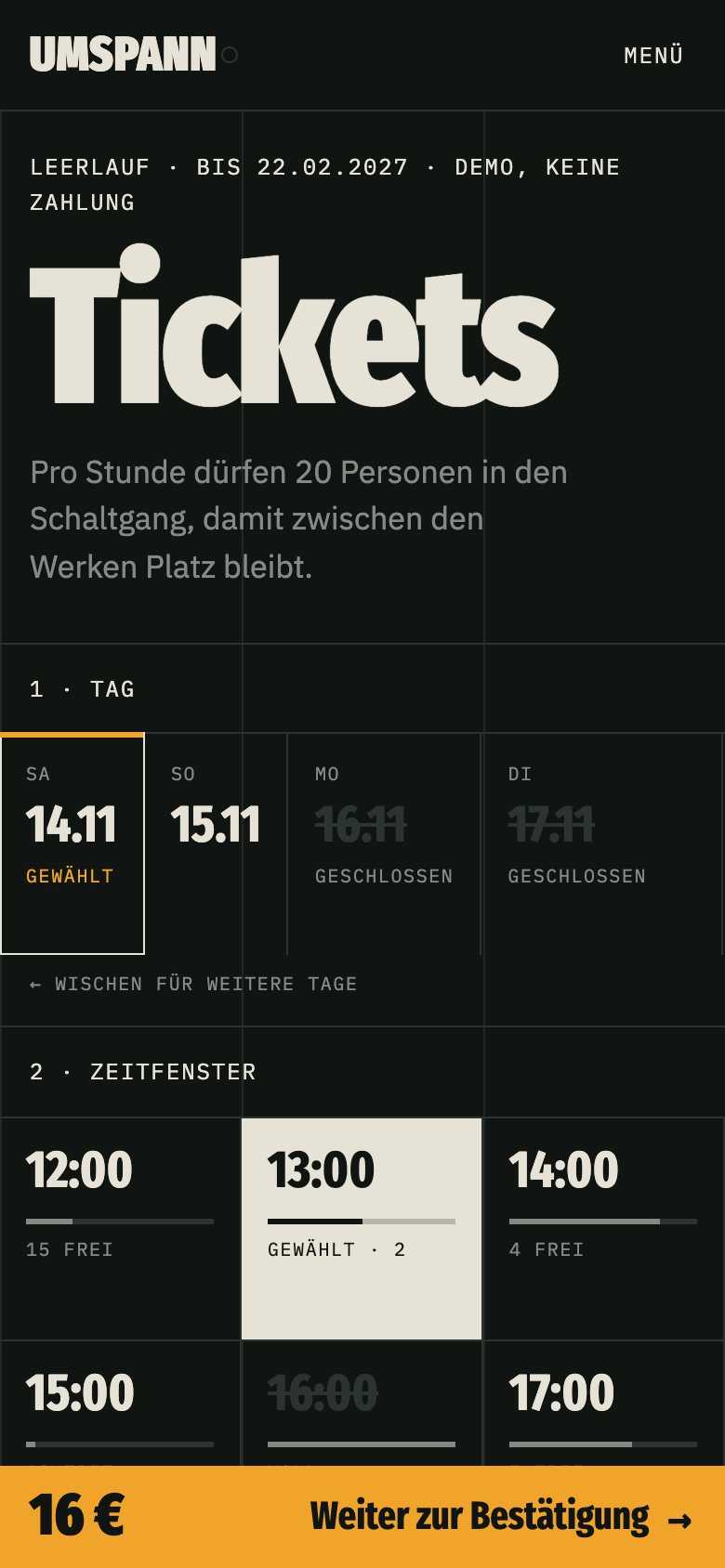
- Demo ticketing with time slots and live capacity, an archive of ten exhibitions drawn as a load curve, and an opening-hours lamp that follows the real time in Germany.
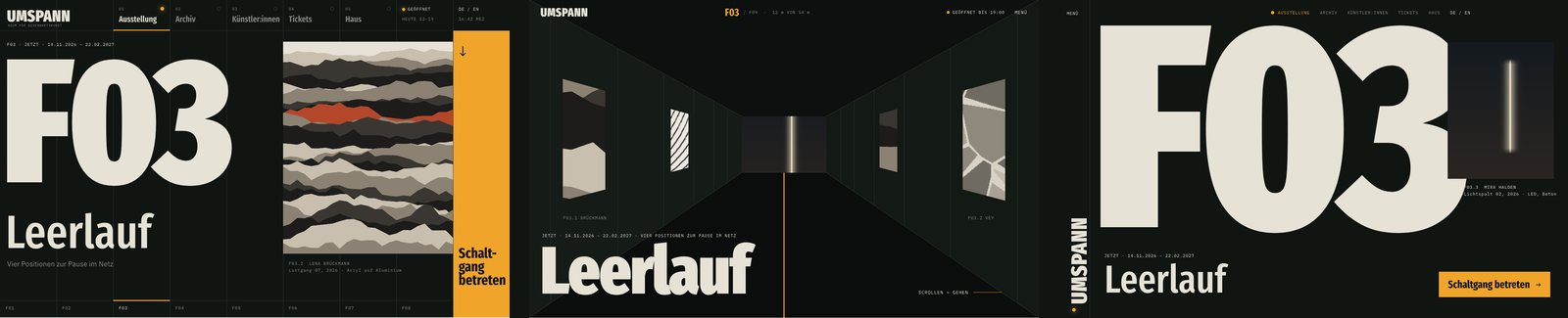
- Art direction before code: an honest look at gallery-site clichés, a moodboard with two palettes and three font pairs, three bold first screens to choose from. German and English, readable with Reduce Motion (the corridor becomes a list), tested in Safari and on a slowed-down phone.
Result
The demo is live: walk through the corridor yourself and listen to the audio guide for Lastgang 07. A museum, a gallery or a showroom can be presented on its site the same way.
Built with
Astro, Three.js, View Transitions · Cloudflare Workers · ElevenLabs (voice) · Fira Sans Extra Condensed, IBM Plex